
Death of the Dashboard: Why Project Visibility Should Be Automatic
Dashboards cost your team time, focus, and trust. Learn why visibility should be automatic and how Todoist's Project Insights make it happen.
You open a dashboard on Monday morning to get a quick sense of where things stand. Three projects, all marked green. Progress bars look healthy. Everything appears to be on track.
Then you check your messages. One thread mentions a blocker that showed up on Friday afternoon. Another has a teammate asking whether the deadline has shifted. A third is just someone tagging you with a quick question that, if history is any indication, will be anything but quick.
So you do what everyone does. You piece together what’s happening from conversations, not from what the dashboard was supposed to tell you.
And the strange part is, nobody thinks twice about it. This is just how Monday works. Open the dashboard, squint at it, then go find out what’s really going on through some combination of DMs, standups, and gut instinct. The dashboard is step one of a five-step process that ends with you finally knowing something.
At some point, it’s worth asking why we all just…accept that?
That’s what this article is about. How dashboards became the default, what they’re costing your team, and why visibility should be something that happens on its own.
Dashboards are the workaround that became the crutch
Dashboards became commonplace because leaders needed to know whether a project was on track without interrupting the people doing the work, and teams needed a way to show that things were moving without digging through tasks manually.
So someone builds a quick snapshot that pulls the right numbers into one place. It takes an afternoon, it works well enough, and for a while, it solves the problem.
Then it becomes a habit. The dashboard gets a name, a reminder, and a standing meeting attached to it. Someone starts maintaining a second one, just for leadership. Before long, there’s an entire layer of work that exists purely to explain the work happening underneath it.
That’s the cycle. You build a dashboard because your tools don’t make work visible on their own. Then you spend time maintaining it. Then a busy week hits and updating it drops to the bottom of the list. The data goes stale. And once it’s stale, you stop trusting it and start working around it.

And through all of that, nobody questions whether the problem was the dashboard or the fact that visibility required a whole separate effort to begin with. As Charles Costa, founder of Lexora Labs, puts it:
“Project dashboard statuses are only useful if the people managing the project actually understand what’s going on.”
A dashboard is only as good as the last person who remembered to update it. And eventually, everyone has something more important to do.
That would still be fine if the cost stopped there. But the time teams pour into building, updating, and maintaining dashboards adds up in ways most people never stop to calculate.
What dashboards really cost your team
Ask any team lead what dashboards cost, and they'll probably estimate a few hours a week. But the real number is much bigger than that, and not all of it shows up as hours.
The time you waste updating the dashboard
The most obvious cost is the time spent keeping the dashboard current. AI can certainly handle some of that, but you still need a human in the loop.
Someone has to update task statuses, check whether the numbers are current, and move things from one column to another so the board reflects what happened this week.

Tiberiu Trandaburu, CEO and founder at Uptalen, estimates that 20 to 30% of his team’s time goes into updating statuses, creating reports, and coordinating check-ins. “It's needed to a point, but it becomes excessive and reduces our ability to execute."
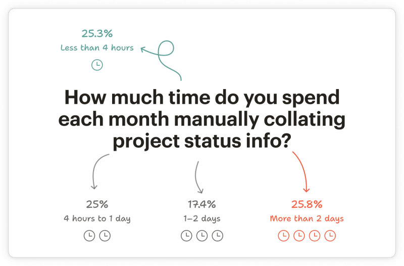
And Trandaburu is hardly an outlier. According to Wellingtone’s State of Project Management report, 50% of project managers spend one day or more each month manually collating project status information.
The context switching cost
The time spent updating a dashboard is only part of the cost. There’s also the cost of context switching, or shifting from doing the work and reporting on the work.
You’re in the middle of something, making progress, and then you stop to open the dashboard, find the right task, update the status, and close it. It takes five minutes. But getting back to where you were takes much longer.

Dimitra Papastathi, Head of Creative, Design, at Typeform, sees this friction daily:
“Updating the work progress on a dashboard requires jumping from one tool to another constantly, which adds some friction to the process. I see it as an inevitable part of the process, although this should happen ideally in the same working environment. For example, if I finish a design in Figma, I update this task within Figma and the rest of the system gets informed.”
But most teams don't have that. The update lives in one place, the work lives in another, and every switch between the two costs focus.
Data backs this up. A Harvard Business Review study found that workers toggle between applications roughly 1,200 times each day, losing nearly four hours a week just reorienting themselves after context switching.
Workers toggle between applications roughly 1,200 times each day.
The cost of meetings that are status updates
Then there are the meetings. Not the ones where someone makes a call or unblocks a decision, but the ones where everyone walks through the dashboard together because it didn’t tell the full story on its own.
A recent survey of over 1,000 employees found that people consider 46% of their meeting time unproductive or unnecessary, with status updates being the number one culprit, cited by 53% of respondents.

These calls aren’t strategy sessions, they’re translation meetings. The team did the work, then logged the work, and now they’re sitting in a room explaining the work.
Dimitra has watched this pattern repeat:
“We regularly hold meetings to check project updates. Most of the people avoid these meetings whenever possible. While it’s an opportunity to bring visibility and ask live questions, the format of those meetings might quickly become disengaging. We’ve tried to reduce them, but for some reason, stand up meetings multiplied.”
Her team eventually tried summarizing project progress in a message thread instead. “Someone could easily find concentrated information this way, without having to attend a meeting,” she says. “I loved that format.”
The false sense of progress
Maybe the most dangerous cost is the one that looks like no cost at all. The dashboard is green, the statuses are current. Everything appears on track, right? It might not be. Christophe Pasquier, CEO of Slite, learned this the hard way.
“Three years ago, all our top-line metrics looked healthy. Activation was up, retention was stable, the dashboard was green. But those are lagging indicators, we had massive strategic and leadership issues, and dashboards were not only hiding this issue but [also] obfuscating it. That’s the thing about dashboards. They measure what you decided to measure. They don’t tell you what you forgot to ask.”
Everything the dashboard measured was fine. But because the dashboard looked good, nobody thought to dig deeper until it was too late. Chris Roy, Product and Marketing Director at Claimsline, sees this as a structural issue. “By the time something shows up on your shiny reports, it’s already downstream affecting cycle time, customer satisfaction, and/or driving compliance exposure.”
Dashboards measure outputs. They don’t measure the friction happening inside the work that produces those outputs.
The dashboard performance trap
If the dashboard is what leadership looks at, that’s what people optimize for.
We’ve all seen what this looks like. A task gets marked as done before it’s properly reviewed or a status moves to green a day early because the standup is tomorrow. Your team starts figuring out how to make their workload look balanced on the board instead of flagging that they’re underwater.
There’s even a name for this. Goodhart’s Law is the idea that when a measure becomes a target, it stops being a good measure.
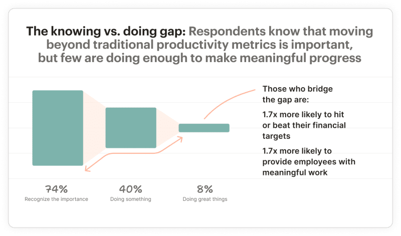
And the data suggests this is a widespread problem. Deloitte’s 2024 Global Human Capital Trends survey found that 74% of leaders said it’s very or critically important to find better ways to measure worker performance beyond traditional productivity metrics. The reason? Because those metrics encourage what Deloitte calls “productivity theater,” where workers do tasks to appear busy rather than drive actual outcomes.
Pasquier has seen it play out up close:
“If you try hard enough, you can spend hours making data sound good, and that’s the original sin of dashboards. You also often see this in reporting, prioritizing short term satisfaction when you report, presenting projects ‘On track’ when what they mean is ‘on track if nothing goes wrong.’”
None of this is malicious. It’s just what happens when the dashboard becomes the scoreboard. But fixing this isn’t only a tooling problem, it’s also a team culture problem. The dashboard creates the incentive, but the culture determines whether people feel safe enough to push back against it.
As Pasquier puts it, “The fix isn't better dashboards. It’s a culture where people feel safe saying, ‘This is harder than we thought, here are the solutions we can start working on now,’ before it becomes a crisis.”
Getting the culture right matters. But even in the healthiest teams, dashboards still have a structural problem that no amount of psychological safety can solve.
Where dashboards break (and always will)
Even if you solve the culture problem, your team reports honestly, and nobody games the metrics, dashboards still have a set of structural flaws.
The most fundamental problem with dashboards is they lag behind reality. A dashboard can only show you what someone last entered, and in most teams, that happens once a day at best. In the gap between updates, the project keeps moving. By the time the dashboard catches up, you’re making decisions based on a picture that's already changed.
That lag exists is because dashboards depend entirely on manual input. Every status requires a human being to stop what they’re doing and update it. The moment a busy week hits, the data stops flowing. The dashboard becomes optional precisely when it should be essential, during crunch weeks or before deadlines.
And sometimes, people don’t update dashboards because they aren’t sure if they provide any value. One Reddit user in a business intelligence community put it bluntly. A manager begged for months to have a dashboard built, treated it like a life-or-death situation, then opened it exactly twice in four months.

Even when dashboards are kept current, they flatten nuance. A project is either green, yellow, or red. But real work doesn’t fit those buckets. A project can be on schedule but headed in the wrong direction.
Tyler Denk, co-founder of beehiiv, saw this at his company:
“Dashboards don’t reveal problems; they delay the moment you realize them. [I] often noticed that dashboards report everything ‘in progress;’ however, in reality, no updates, no async communication are the real problem where teams realise [that a project is in trouble]. If you need to ask for an update, the system has already failed to make the work/red flag visible.”
The nuance was in the silence. But the dashboard had no way to capture that.

As long as visibility requires a separate effort from the work itself, it will always drift from the truth.
Redefining what visibility means
Every problem in this article traces back to the assumption that visibility is something you produce after the work is done. You do the work, then you stop, and then you report on it. The dashboard, status update, and check-in meeting all exist because of that assumption.
But what if real visibility isn’t a report you generate or a dashboard you maintain? What if it’s the ability to look at a project and understand where things stand without asking anyone to stop what they're doing and explain it? As Trandaburu puts it:
“The more a system represents the truth, the less you have to create additional visibility on it.”
What changes when visibility is built in
When visibility is built into how your team already works, the first thing you get back is time. No one is spending their Monday morning updating a board or preparing a summary for the weekly check-in. The reporting layer disappears.
The status meeting loses its reason to exist. You don’t need 30 minutes on the calendar to reconstruct what happened last week because anyone can already see it. The meetings that survive are the worthwhile ones where people make decisions, solve problems, and unblock each other.
You can also trust what you see. When project health is based on actual activity and momentum rather than what someone typed into a field, there’s no incentive to shade a status green. The system is reading from the work itself, not from someone’s summary of it.
And risks surface earlier. Instead of waiting for someone to raise a hand in a standup, you can see problems forming via overdue tasks piling up, momentum slowing down, workload clustering on one person. These signals don’t require anyone to report them. They just show up.
The bar is a way of working where the work itself tells you what’s happening.

How can you make visibility automatic?
What does automatic visibility look like in practice? It looks like a tool that can tell you whether a project is healthy, who's overloaded, and where things are stalling, all without anyone having to stop and update a board.
That’s exactly what we built with Project Insights.
Project Insights isn’t a dashboard you set up or a report you configure. Instead, it’s a set of widgets that read directly from your team’s actual work and surface what’s happening automatically. You don’t need to use templates, maintain it regularly, or share updates every Friday.
Take the most useful widget of all. The Health widget looks at your team’s work patterns, task completions, overdue items, and overall momentum. It then gives you a status on the project: Excellent, On Track, At Risk, or Critical.

No one has to set the status manually or decide whether the project is green or yellow. The system calculates it from what’s really happening and can be automatically updated at any time.
The At Risk widget takes this further by surfacing warning signs before they become full problems. You can see the tasks approaching deadlines, work that’s stalled, and areas where momentum has dropped.
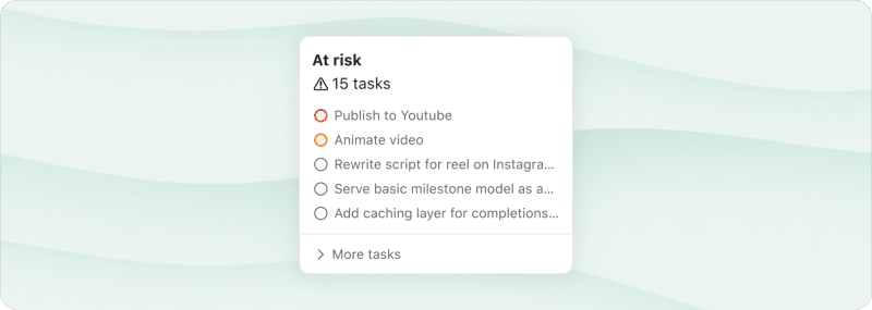
These are the signals that, in a traditional setup, would only come up when someone thought to mention them in a standup or when a deadline was already missed. Here, they show up on their own.
Progress and Assigned round out the picture. Progress shows how much of the project is complete based on tasks done versus tasks remaining, updating in real time as scope changes.

Assigned shows who’s working on what and how workload is distributed, so you can spot if one person is carrying too much or if tasks are sitting unassigned. No one has to report any of this. It’s just visible.
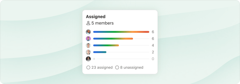
What if you work on multiple projects at once? You don’t have to check each project individually. Your workspace overview shows Health and Progress across every project in one place. When something catches your eye, click through for the full picture.

None of this requires your team to do anything other than their actual work. There’s no setup, no configuration, no weekly maintenance ritual. You use Todoist to manage your projects. The visibility is just there.
Dashboards were never the answer. They were the best option available when the tools teams used every day couldn’t tell you what was going on. So teams built a second system to explain the first one, and then spent hours every week keeping that second system alive.
That made sense for a while. It doesn’t anymore.
The cost is real, from the time spent updating and the context switching to the meetings that exist just to interpret what the board says and the slow drift toward optimizing for appearance over progress. Yet if visibility depends on someone remembering to report, it will always lag behind, go stale, and eventually get ignored.
The alternative isn’t a better dashboard that’s updated more frequently. It’s a system where visibility is automatic. Where project health, progress, risk, and workload are visible because the work itself makes them visible.
That’s what Todoist's Project Insights was built to do. Try Todoist for free and see what your projects look like when visibility takes care of itself.

Rochi Zalani
Rochi is a writer covering productivity, SaaS, and the freelance lifestyle.